I built the brand books, then spent three years finding out which parts of them were true.
- Role
- Brand identity
- Art direction
- Web design
- Front-end
- Context
- Sell and Stay, Vienna
- Lebenswert, Hamburg
- Markets
- Austria
- Germany
- Since
- 2022
The situation
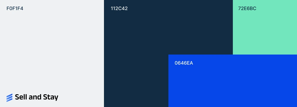
Three brands in two countries. Sell and Stay and RuhestandPlus operate in Austria, Lebenswert and RuhestandPlus in Germany. Each lets older homeowners release the value of their home and go on living in it, through a partial sale or a sale with a lease back.
The structure came out of an A/B test. Two Austrian brands launched with different products — partial sale versus sale-and-leaseback — and both now carry the full offering, because the split that mattered wasn’t the product, it was who each brand talked to.
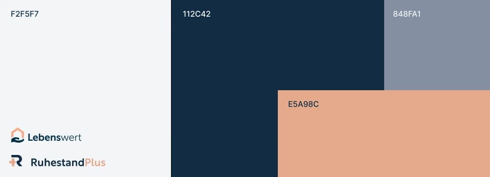
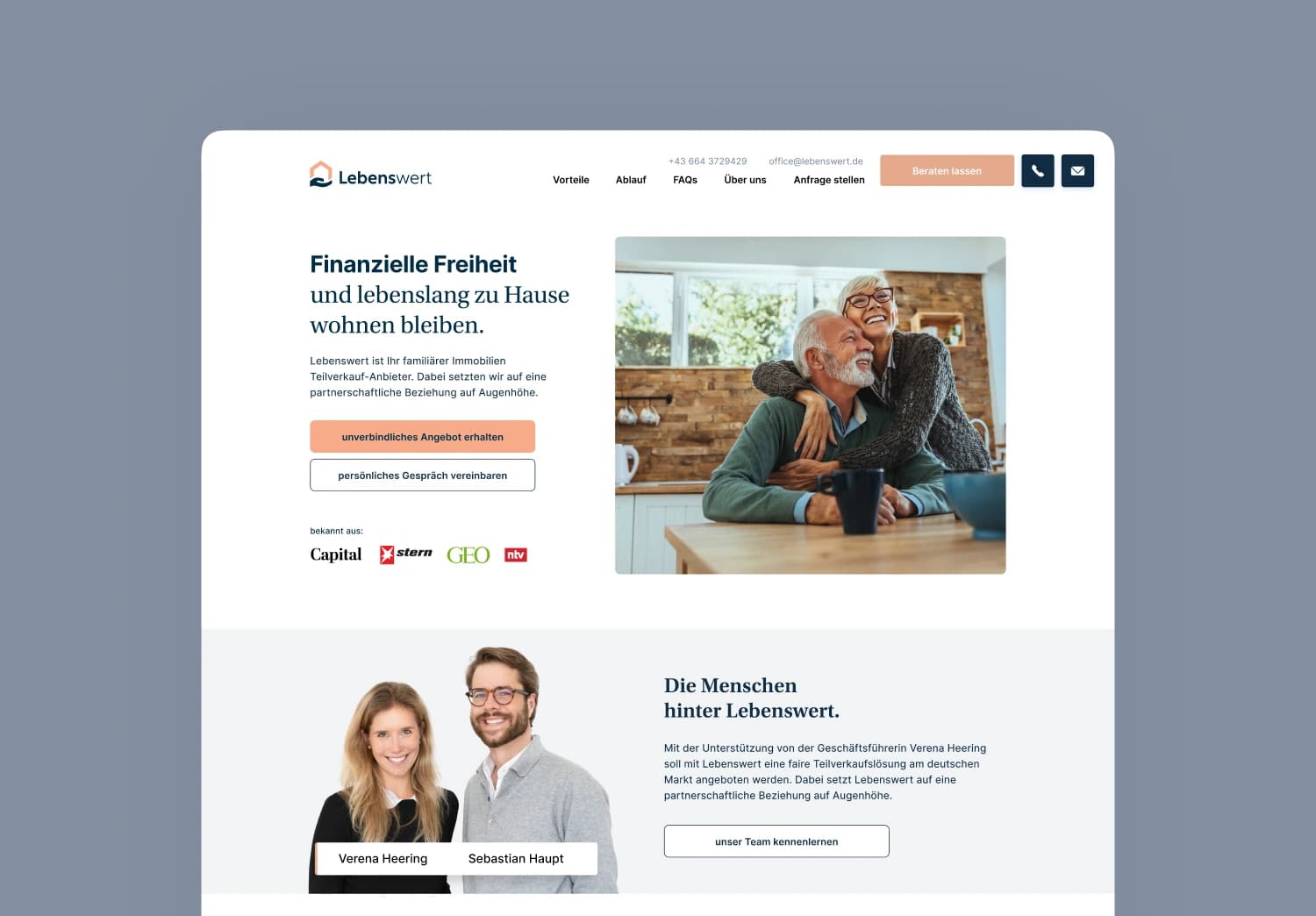
That history shows in the design. Sell and Stay came first and was meant to be the umbrella brand, so it stands more on its own. RuhestandPlus and Lebenswert share a brand language and most of their material — the German launch was largely a logo swap on an existing system.


What I built
I started with the corporate identity for all three, and the scope grew from there.
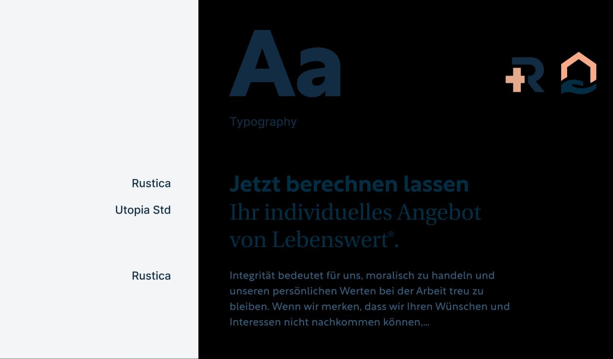
- 01Corporate identity for all three: logo, typography, colour, image language
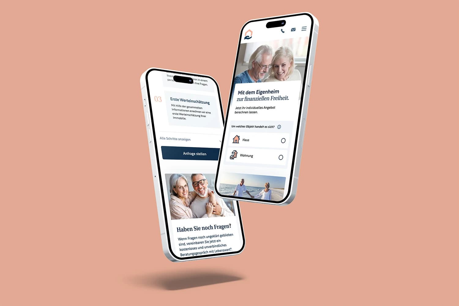
- 02New website sections in JavaScript — sliders, horizontal scroll, video, animation
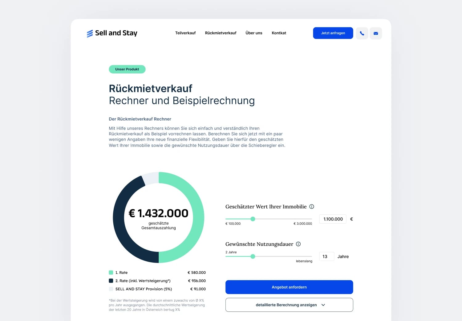
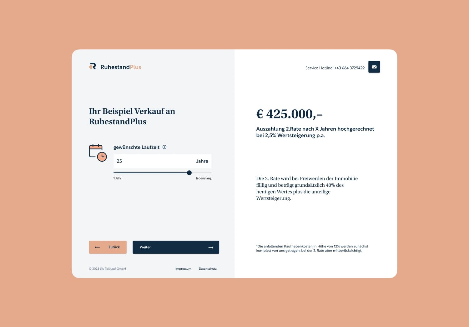
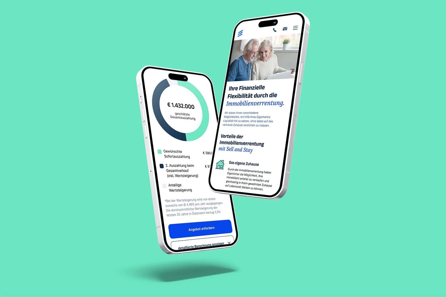
- 03A working payout calculator on the customer-facing sites
- 04Every ad creative and image concept, at times in parallel with a commissioned agency
- 05Business cards, information sheets, brochures, folders, notepads
- 06Templates for Word and presentations, internal and B2B
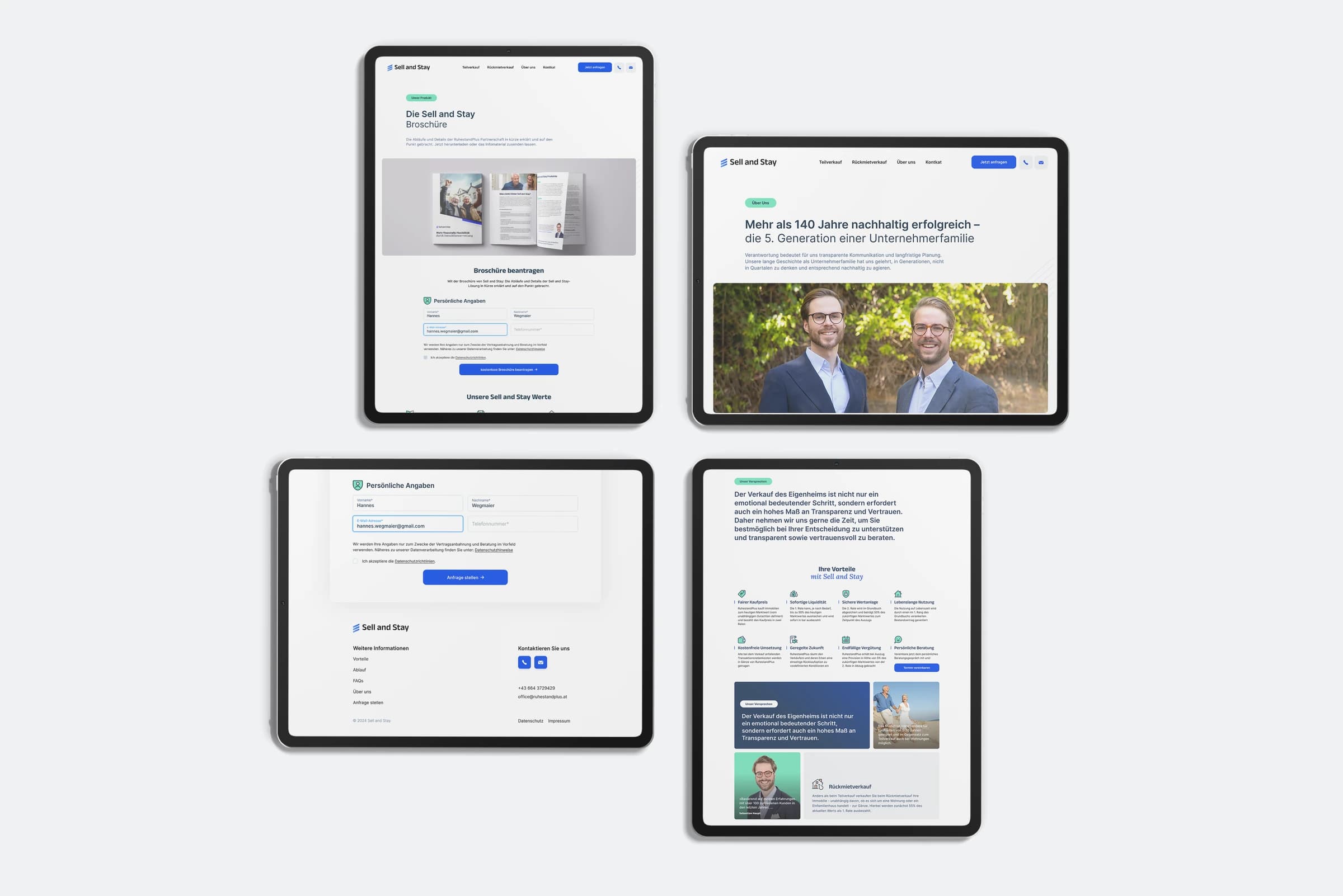
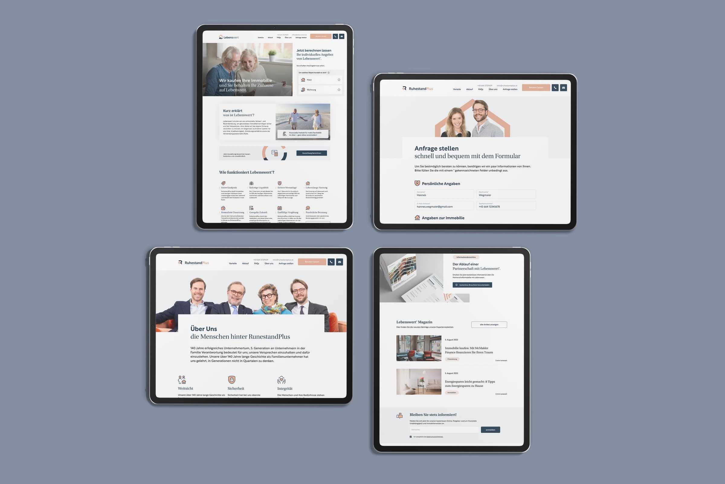
Taking over the front end
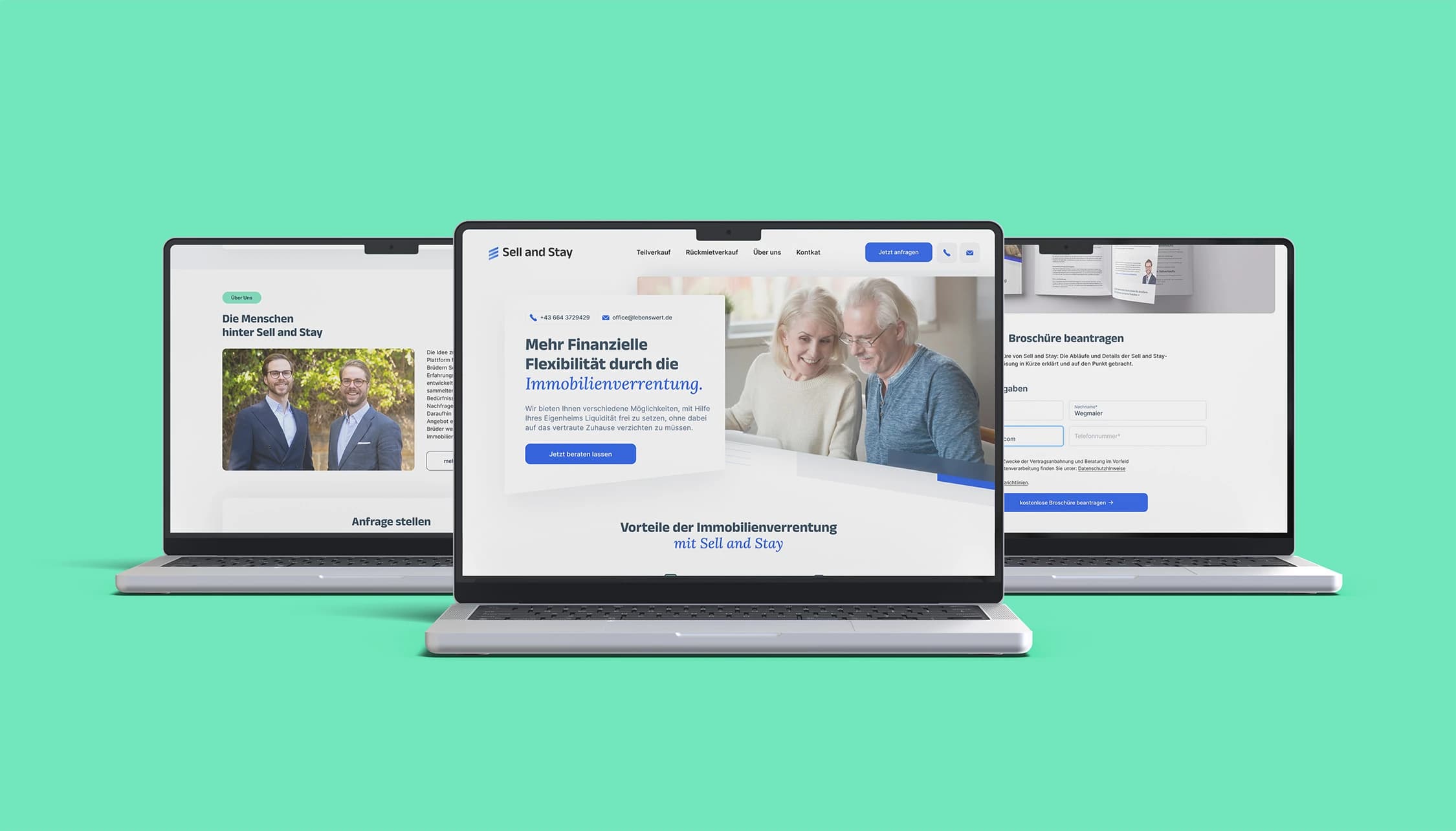
For a long time the websites were implemented by others, and the translation from Figma to live was consistently imprecise — container widths off, text and icons misaligned, spacing that drifted from the system. Some of that is still visible today.
So I took over the technical implementation and rebuilt somewhere between half and two-thirds of the site in HTML and CSS myself.
That decision is the pivot in my whole path. Once you’ve written the CSS, you stop designing things that survive handoff badly, and the distance between the design and the shipped thing stops being someone else’s problem. Everything I’ve built since started there.
What I learned
There’s a real gap between developing a brand system and watching people use one.
The agency version of this job ends at the brand book. Mine kept going, so I got to see which guidelines hold up in daily use, which get quietly ignored because they’re impractical, and which situations the brand book never anticipated and the team had to improvise around.
I’d write a much shorter brand book now, and a much longer set of templates.