A fleet of robots keeping a lunar colony alive.
The reference that fit them was Asana, not a spaceship.
- Role
- UX/UI concept
- User flow
- Wireframing
- High-fidelity screens
- Context
- DesignFlows 2025
- Bending Spoons
- Team
- Two designers
- With Lilo Hohenberger
- Built in
- One weekend
The situation
DesignFlows is Bending Spoons’ annual design competition. The 2025 brief asked for an app to manage hexabots — general-purpose robots that a lunar colony depends on for mining, farming and hauling water. We had one weekend.
The brief also split the audience in two, and the halves wanted opposite things. Explorers and researchers running the colony’s actual operations wanted efficiency: many bots, many jobs, as few taps as possible. Families living there wanted something simple enough to use without being trained on it.
The turn
The obvious answer to two audiences is two modes — a pro view and a simple view. We didn’t build that. Two modes is twice the surface, twice the decisions and two products to keep consistent, and it treats the split as a difference in kind when it is a difference in volume: the family sending one bot for water and the researcher sending nine for ore are doing the same thing at different scales.
What both are actually doing is assigning work to machines and wanting to know whether it got done. That is not a sci-fi control panel. That is a task manager — closer to Asana or Jira than to anything with a viewport and a warning klaxon.
Strip the setting away and it is a project management tool. That was the finding, not the compromise.
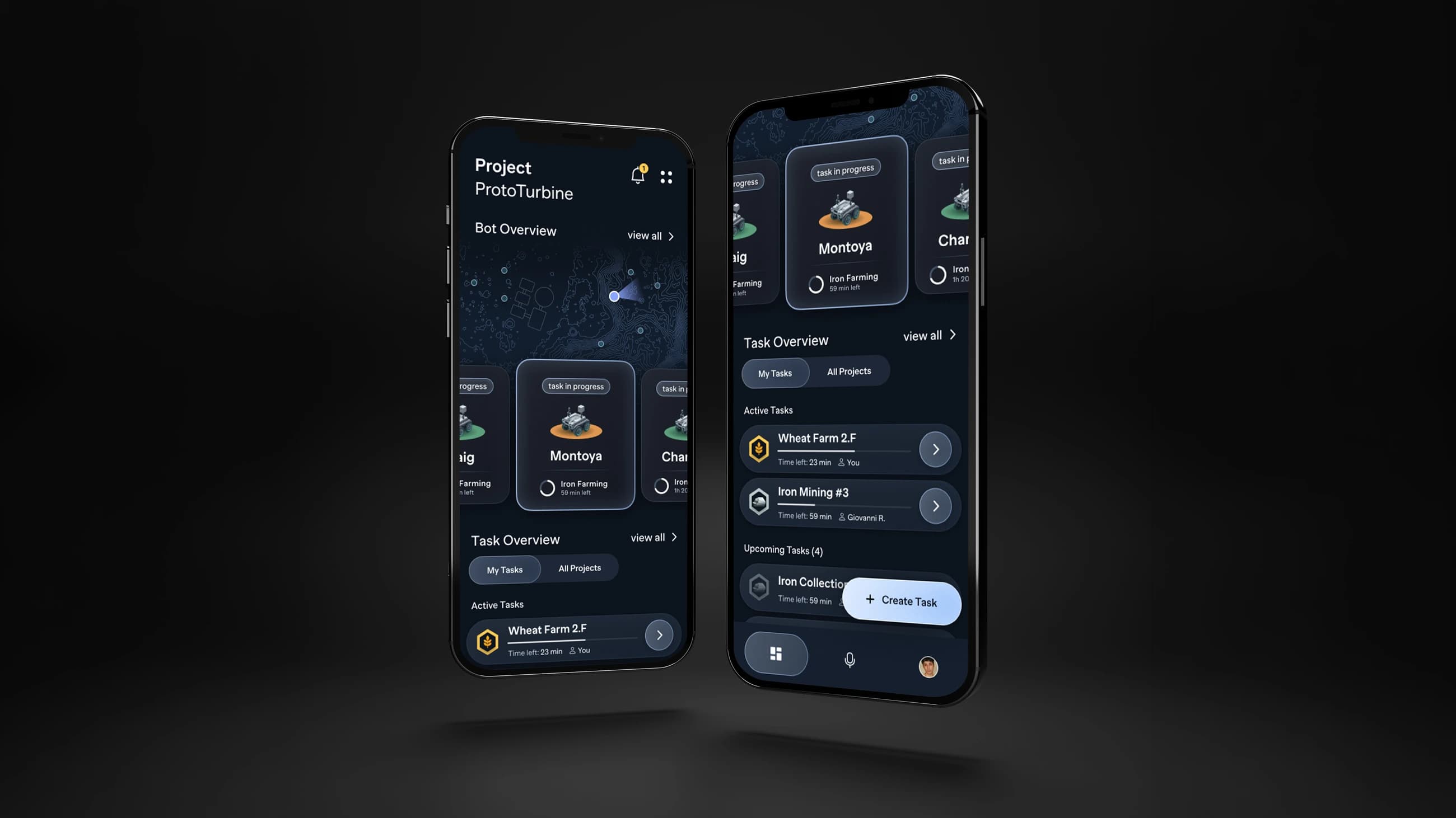
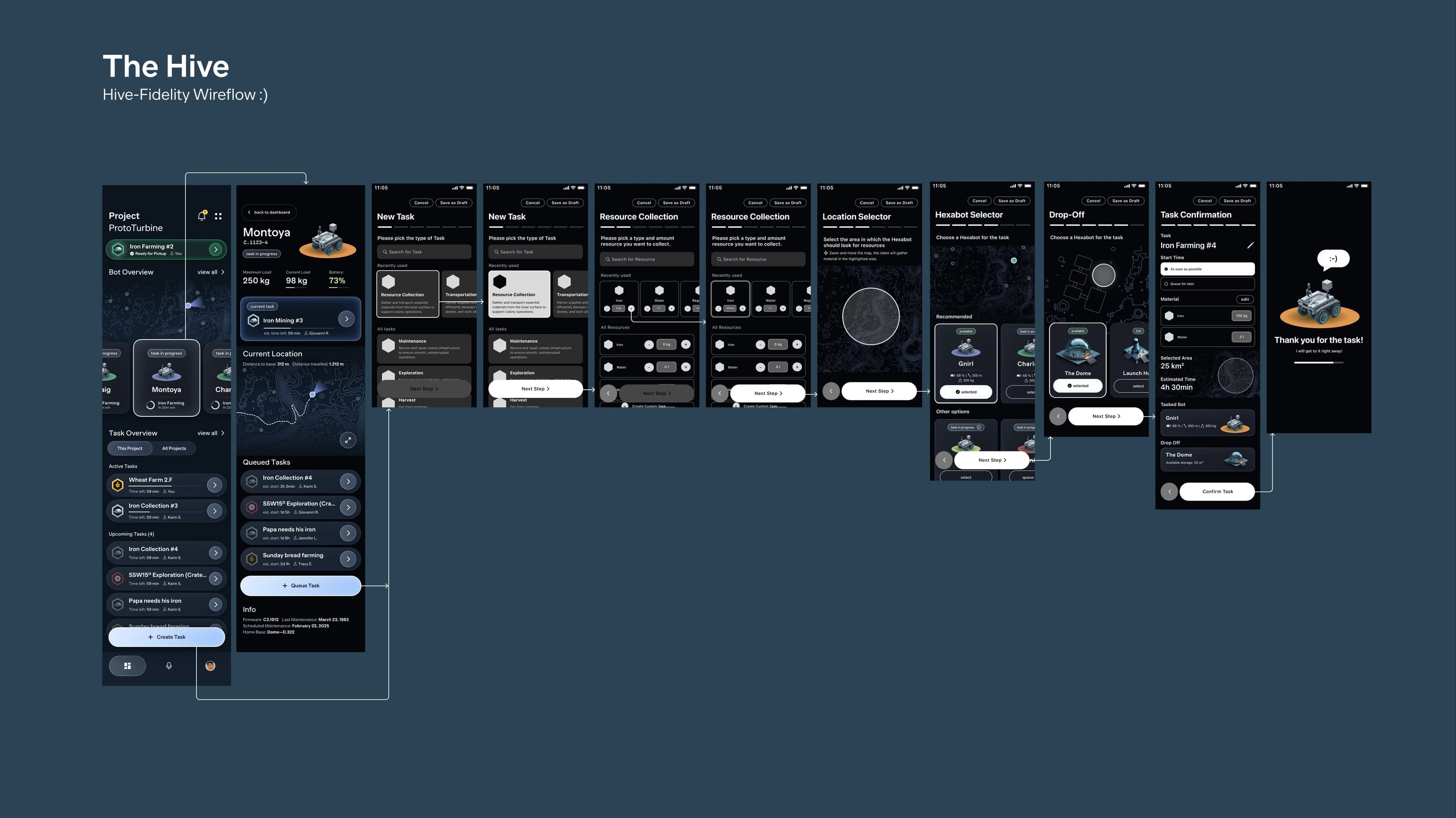
So the app opens the way a project tool does: straight into the last project you edited, no landing screen and no mode picker. A map of your hexabots sits at the top with the most recently tasked bot first, and a task overview underneath splits into active, upcoming and queued. For the researcher with nine bots out, that is a status board. For the family with one, it is a single row that says the water is twenty-three minutes away.
Creating a task
One sequence of small decisions, each one a screen, each one with a default already filled in. Nothing asks for a number the colonist would have to go and find.
- 01Task typePicked from a fixed set. No custom categories — see below.
- 02ResourcesOnly if it is a collection task: what to bring back, and how much of it.
- 03Search areaDrawn on an interactive map rather than typed as coordinates.
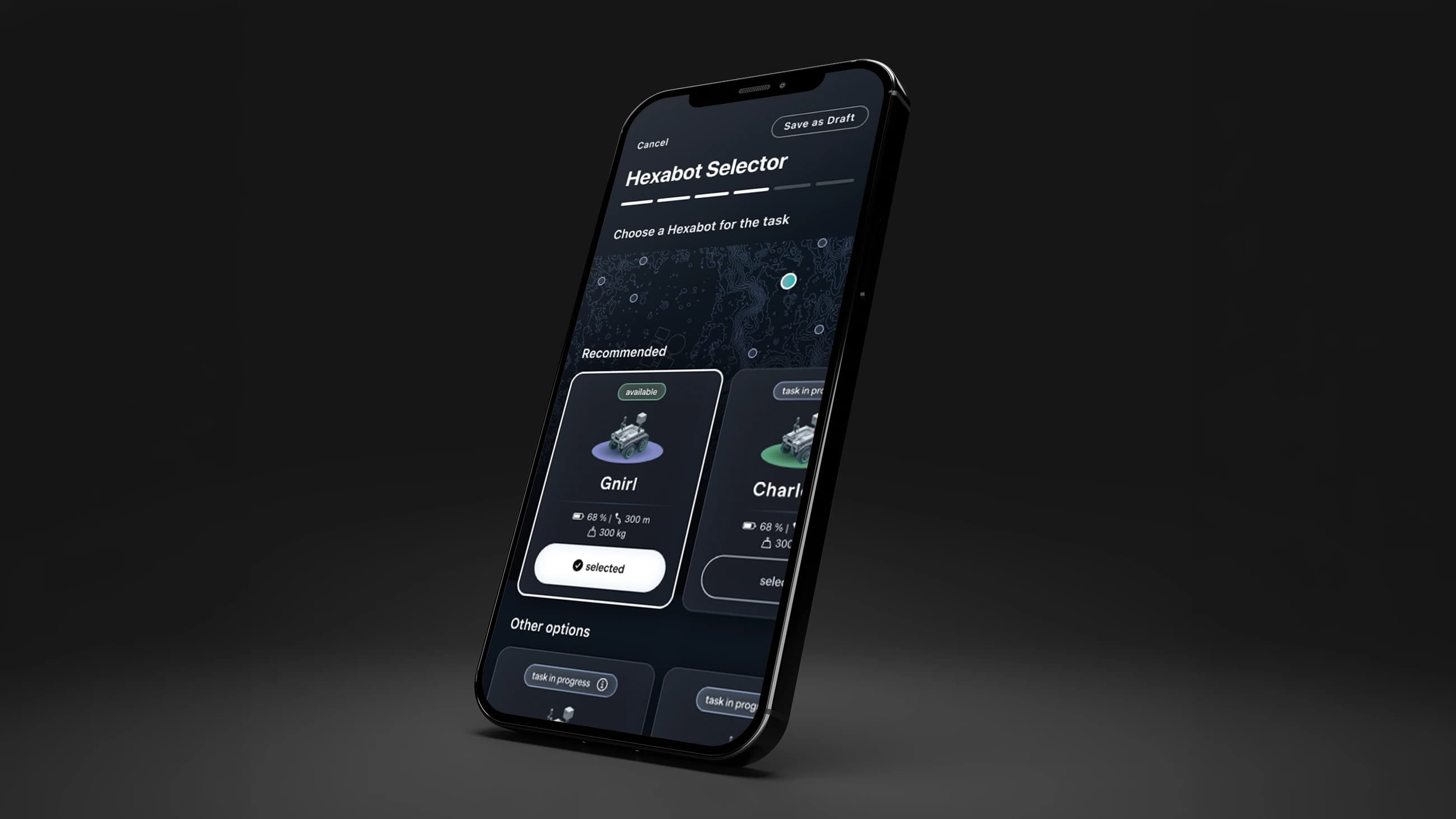
- 04The botRecommended automatically on weight capacity and remaining battery. One tap to override.
- 05Drop-offWhere the load ends up, with the storage left there shown before you commit to it.
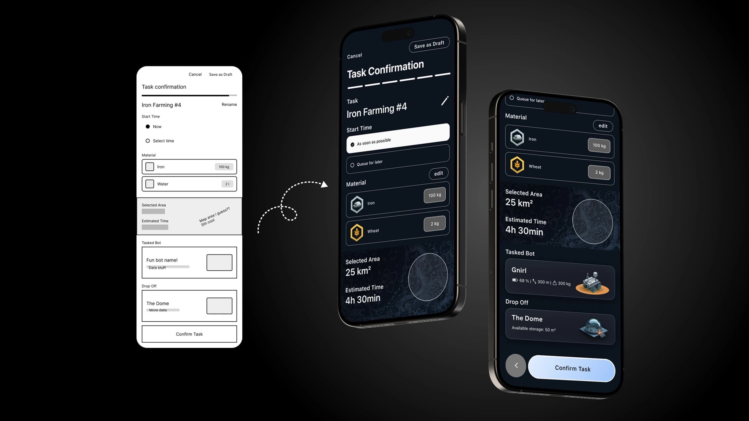
- 06ConfirmThe whole task restated on one screen — area, estimate, bot, destination — before anything moves.
There is also a voice route, modelled on how ChatGPT’s voice mode behaves rather than on a command line: you talk through the job and it fills the same sequence in. On a surface where you may well be wearing gloves, that is not a novelty feature.
Once a task is running it leaves the app. A live activity widget carries the progress on the lock screen, and exactly two notifications bracket the job — one when the bot starts for the drop-off, one when it arrives. Nothing in between, because nothing in between is actionable.
The task types are a fixed list, not a text field
A free-text task field would have been faster to design and would have read as more powerful. It would also have been a lie about the fleet. Hexabots are pre-programmed machines, not general intelligences — they do the jobs they were built to do, and an input that accepts anything promises capability that does not exist behind it.
A fixed set also makes the recommendation possible. Because the app knows the task category, it can match a bot on weight capacity and battery instead of asking the person to work out which of nine robots is the right one.
Admins can give the bots human names
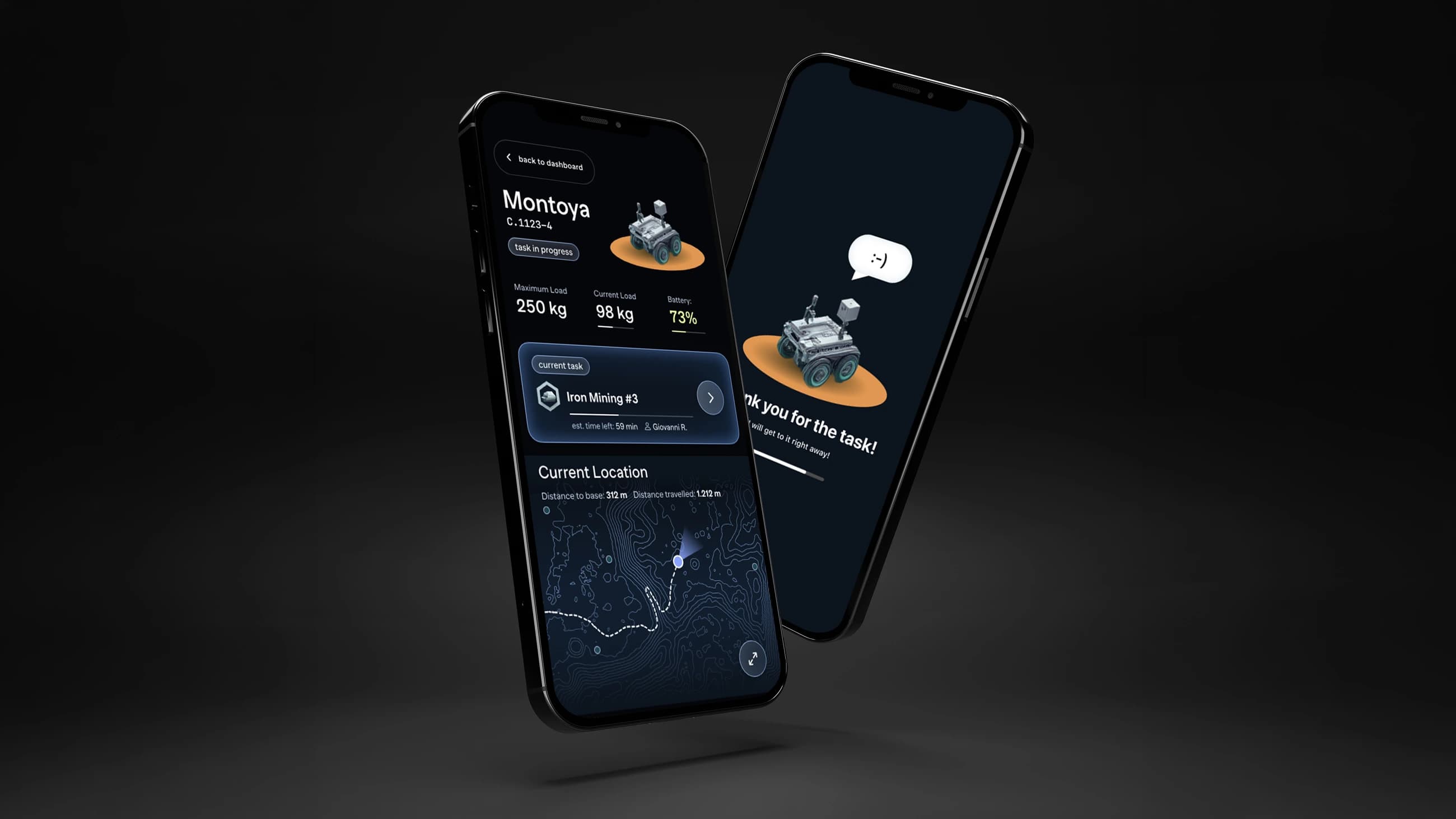
It solves something real. Four bots working the same crater on similar jobs are almost impossible to tell apart in a list, and the serial numbers that distinguish them — C.1123-4 — are exactly the kind of string a person reads twice and still gets wrong. Montoya, Gnirl and Charlie are not.
It is also just true to how people treat robots. Anyone who owns a Roomba has named it inside a week. We designed for that instinct rather than designing it away, and let the bot answer back when it takes a job.
Task manager underneath, moon on top
Admitting the thing is a task manager does not mean it should look like one. It would be strange to run a lunar colony from something indistinguishable from a sprint board, so the dashboard is built on a map instead of a list, and the atmosphere is carried by small things — the topography under the bot positions, the isometric bots, the dark plate the whole thing sits on. None of it costs a tap.
The competition specified its deliverables exactly: a wireflow of one complete journey, and three key screens at named frame sizes. Building precisely those and nothing else was part of the work.
One weekend
With two days the process mattered as much as the idea. We started ugly on purpose — rough wireframes with placeholder scrawls like fun bot name! and map area i guess?? — and refused to open a visual file until the whole flow held together end to end. Every hour spent styling a screen that later turns out to be in the wrong place is an hour a weekend does not have.
The flow survived that translation nearly intact, which is the only real evidence that starting ugly was the right call.
Where it got to
The Hive was picked as one of forty finalists, and we were invited to Bending Spoons’ office in Milan.
It is a concept and it never met a user. Nothing here was tested, the voice mode is a mock-up of an interaction rather than a working one, and a flow that reads well to a jury in a weekend is not the same as one that survives a person in a hurry. What I would take from it is the judgement call, not the screens: the brief invited a sci-fi control panel and the honest answer was a task manager with a map in it.